When it is better not to answer the question ‘what is art’.

The artist, Martin Creed, was interviewed this morning on BBC Radio 4’s The Today Programme. http://www.bbc.co.uk/programmes/b04982j9 He was asked the question: ‘is a piece like your ‘light going on and off’ in a room an artwork?’

The question arose as part of a discussion about the forthcoming exhibition at the Tate Modern in London about the Russian artist Kazimir Malevich whose famous painting of 1915 (1913/23 or 29) is the centrepiece of the exhibition, but which caused such an international stir when it was first seen 100 years ago for its revolutionary boldness. Malevich painted a simple black square on a canvass to take the representation out of painting and to try and show that art was about ideas and more importantly, about emotion.

Nothing like his work had been seen before and it broke with every painting convention. Representation had been played with by the impressionists, the pointillists and by Picasso, but Malevich’s work Black Square, reduced the aesthetic to a single colour or absence of colour. What caused further outrage was that he insisted that it be hung across the corner of the room (gallery). This might seem uncontroversial, but the corner was the place in Russian Orthodox tradition where religious icons would be hung.

So not only was Malevich breaking with artistic convention, but he was also challenging religious belief and habit. We are used to such pared down aesthetic nowadays, and even more shock tactics in art, but Martin Creed is still able to cause a considerable stir with his minimal artworks.

Which brings me to the Today Programme this morning; Creed was asked how he responded to criticism that his work was not art. He deftly turned this question around by saying he was not interested in whether or not people thought it was art or good or bad art, but whether people were emotionally moved by it or not. This gets around the whole debate about what is art and what is good or bad which seems to obsess large sections of the media.

So, Creed by his answer implied he was not concerned to engage the viewer in a debate about the notion, theory or practice of art, but whether someone liked it or not. It was as simple as that. Once you ask that question, you level the ground for people. You don’t need to be an artist or critic or art connoisseur to appreciate something, but simply how you respond to an artwork on a human level.

It could be possible to argue that Creed was sidestepping the question like politicians famously do especially on the Today Programme, by answering the question with a question, and then answering his own question. But, he sounded somewhat inarticulate on the Today Programme, and I could hear the producer in the programme autopsy afterwards asking who booked him as a guest when he was not a good talker on radio – something they seek above all else. But his diffidence with works illustrated a reluctance to enter into a knee jerk debate and to try and shift it to one where he could let the answer be provided by someone else. Yes it was canny, and he sounded the canny Scotsman to be sure, but he also hinted at some of the wider debate within the art world about the purpose of art and where art might be going. So 100 years on from Malevich’s Black Square, there is still plenty to say about contemporary art, maybe just not on the Today Programme, or not by an artist like Creed who is as economical with words as he is with his visual language.

Kazimir Malevich, Black square, 1915

Kazimir Malevich, Black square, 1915

Gregory Hayman, Black on Black print

Gregory Hayman, Black on Black print

Standard

The Art of Forgetting

I have undertaken to try and produce a range of artworks that are eminently forgettable. I want to see if I can erase my ego and produce works that are unnoticed or eclipsed by the setting or the everyday around them. I want to do this for several reasons, firstly to push my thoughts on memory and art and secondly, to understand why some artworks are forgotten, and what is happening in the process of forgetting. I hope that this exercise will shed some light on how the memory works and whether it is possible to consciously produce forgettable art or whether art becomes forgettable because its bad, indistinguishable from works around it, falls outside the artistic canon or for some other reason.

So sitting down with materials and ideas, I begin making work. But none of it so far appears to be forgettable. Am I doomed to failure before I start or is there something else going on in the way I make art.

With colleagues this week I showed them the work I’ve been making and solicited their feedback. But I could have answered the question myself. The work I made was memorable, particularly the film (working title armless which will become The Jealous Memory).

I think this is happening because before I can make new work I often have to purge myself of all the remaining ideas for work that have been swilling around my head for weeks, months or sometimes years. These ideas have a habit of popping up after a gestation and I cant do anything until I have attended to them.

Gregory Hayman, The Jealous Memory, film 2014

Gregory Hayman, The Jealous Memory, film 2014

It is curious. As an undergraduate, I found that I sometimes was at my most creative after a unit hand-in. It was as if I had been incubating a body of work during the preceding period and adrenalin or the relief of completing and handing in work unleashed an excess of creative energy that I could not ignore. Sometimes in these post-hand in periods I often produced some of my best works – like the piece which was short-listed for the Jerwood Drawing Prize – this and the other pieces linked to it emerged in one of these creative orgies.

So in the past few weeks I have made 7 artworks worthy of documenting and sharing, and another 3 are in production. What then of the project to realise the forgettable? Clearly, I have failed thus far and with several other works doomed to fail I am seriously running out of time or energy to attempt my quest. It may be that after this period of artistic fecundity, I will have provided myself with the space to attempt the works I plan, although, I know not what form they will take. I am thinking about the pared down or stripped back aesthetic of artists like Gedi Sibony or Carla Black but I wonder whether that is too easy an ambition to seek to develop or whether it is too darn difficult and that to make things which seem simple is in fact the most challenging artwork to make.

Standard

Thoughts on what it means to have a mixed practice as an artist

As I am an artist with a mixed practice, I’ve been reflecting on what it might mean to have a mixed practice. I been aware of both the advantages and disadvantages for sometime, but in a recent conversation with Paul Fieldsend-Danks, he suggested that my artist statement on my website did not adequately reflect someone who has a mixed practice. My first reaction was to try and rewrite my statement so as to provide more guidance to someone looking at it. But this, only partly addressed the problem. I became aware; that I needed to do more than just amend my statement. What I needed, was a more profound contemplation of what it meant to be an artist with a mixed practice first and foremost. I then need to consider how I might articulate that in my statement and in other ways. This led me to try to research thinking and critiques of artists with mixed practices, and on the whole notion of mixed practice in particular.

By looking at artists that I knew had mixed practices, like Martin Creed and Tracey Emin, I hoped to find a key to unlocking this particular vault. But the books and essays I’ve found so far, just talk about their work. They don’t reflect on what a mixed practice actually means in relation to the specific artist and what might be inferred more generally. I need to approach the question from a different direction. Even then by typing in searches “artists with mixed practices” or having “a heterogeneous practice” has not proved to be terribly helpful either.

I sat and reflected, was I a jack-of-all-trades and master of none; was I an artist who didn’t know his arse from his elbow? Was it the case that because I hadn’t hitched my sail to a particular artist mast, that I really didn’t belong? So was it a question of belonging that I was avoiding confronting–there’s certainly an element of that as I prefer the role of the outsider–but was it that there wasn’t really room in the lexicon of art practices for the practice of mixed artist, or rather an artist with a mixed practice?

Paul FD has thrown me a lifeline by suggesting that I am looking at things from the wrong end of the telescope (my interpretation – not his words). What he suggested was that it all about context underpinning a practice and if you understand and articulate that properly then it is unnecessary to worry about what a mixed practice is.

So that leave me to consider the context of my work and practice and I feel I’m circling it but unable to pin it down – and pinning down is an emerging theme and pinning down or the avoidance of it, may in fact be the context. But in the meantime, I feel a bit like Dorothy having had the house picked up by a twister and deposited somewhere else remarks: ‘Toto I don’t think we’re in Kansas anymore.’

Standard

Review of Phyllida Barlow’s Dock at Tate Britain, London

    Image

This is Barlow’s largest piece of work to date and dwarfs the Duveen Galleries at London’s Tate Britain.  As a huge fan of her work and contribution to contemporary British Art, I was full of expectation.

It’s a magnificent piece, there is no denying, stretching almost as far as the eye can see along the length of this central atrium within the gallery.  That is if one could see the whole sculpture as a complete whole.  But, you cannot do this as its many elements obscure a total view of the whole.  Instead, the viewer is forced to negotiate around the work, weaving a path, where one large object obscures your path and your ability to see.

Image

Dock contains all of the Barlow elements, lots of wood, lots of packaging material (black bags, parcel tape, string, rope) and reused material – at least, it appears to be reused, but given that this is her biggest work, its hard to see where all the material comes from, so I am assuming that much is new but made to look reused.  This leads one to consider how much the recycling of materials from one work to another is part of her USP, or whether it is just a practicality based on the contingency of cost and the type of materials and aesthetic she embraces.   I am not sure I really have the answer to that one here.  So let’s assume that some of the wood bearing the traces of dripped paint is reused from earlier pieces (if it isn’t, it manages to effect that conceit very convincingly).   Then this work begins to gel as part of the Barlow canon.

Image

But I am not convinced that upsizing her work has lead to the masterpiece I was expecting.  Yes it’s a brave work and yes Tate’s director, Penelope Curtis has to be applauded for commissioning this work, but it’s not a fully resolved piece in a number of respects.  The high structures, which resemble Russian wood scaffolding (at least Soviet era Scaffolding, I’ve not seen the post era stuff) give the elevation that Barlow has successfully utilised in the past, I’m thinking of the work in the downstairs lobby of her recent Hauser & Wirth Piccadilly show.  What’s missing in the Tate piece is something of the vulnerability of that work, the precariousness of the elevated objects on flimsy stems.  At the Tate the structures are rigid and box like and feel stable, even if some elements over hang them.

Image

So what’s missing from this piece is some of the vulnerability of her earlier works and also some of the colour and curiosity too.  Elements look derivative like the large tube structure and the high platforms have echoes of Tracey Emin’s raised seaside chalet or big dipper in structure and material but lack the interest Emin’s does and the vulnerability she engenders.  Also, the desire to see above our head height which Emin’s work provokes.  This is lacking in Barlow’s work at Tate and was so masterfully there at Hauser & Wirth where you could see up close from the upstairs balcony what you could only glimpse and imagine from below.  Now I do chide myself for not looking at Tate Britain from the member’s lounge or its environs on the upper floor to see whether there were any elevated views of Barlow’s Dock, and it is possible there are.

Image

The Barlow Dock, has echoes of the riverside activity of times past on the adjacent Thames, but it seems like a flimsy hook to base the work and is also not necessary to anchor the piece.  It does not add to the work and it quite possibly detracts by over determining responses to the piece, stripping it of enigma and encouraging viewers to read things into elements that might not be helpful.  There was one element that I think really didn’t work and that was the collapsed piece that looked too self-conscious. We are all well acquainted now with the language of sculptural pieces that have constructed and deconstructed echoes side by side.  It’s no longer necessary and looks jokey in a more visually enlightened age.  We need to develop a new vocabulary, that language has been thoroughly explored and feels dated.

Image

There is much to admire and I will certainly visit again, but I think this large commission has been an important learning curve for Barlow as it should be for all artists who are encouraged or are contemplating up-scaling their work.  Sometimes it does not come off.  We need to treat the urge to up size with extreme caution.  It might be that Barlow’s work does not suit the grand gesture like this and is better small.  And on that note lets hear it for the smaller artwork, sometimes less is more and we shouldn’t feel embarrassed or uncomfortable with that.

Image


Standard

What’s The Point Of It? Review of Martin Creed Exhibition, The Hayward Gallery, London


Image

I want to argue with my own instincts in this review because I like the work of Martin Creed. I think there would be little of interest to say except that I liked the show and then to single out particular exhibits that I found most interesting and explain why. I think it might be far more interesting to take a contrary position and to attempt to argue against Creed’s work and my own attraction to it, in order to examine the nature of my interest. I also think one has the fiercest arguments with those one is closest to. Because I see many similarities between my work and that of Creed’s, I feel as if I am arguing with myself, if that doesn’t sound too pretentious.

The exhibition is the first time that London has had a major review of Creed’s work, and builds on the splendid run of exhibitions that the Hayward has had over recent years. It is also the first large-scale collection of his work to be shown since he won the Turner Prize in 2001.

Ranging from the whimsical to the downright offensive and shocking, the exhibition comprises extensive tones and much light and shade. It has been well constructed in this regard, with moments of high drama punctuated by reflective calm. But I wonder whether Creed and the curatorial team have worked too hard and too self-consciously to manipulate the audience.

Image

The exhibition begins with a revolving neon sign on a huge scale – resembling some demented Angel of the North with dangerous and threatening arms like helicopter blades barely above head height and liable to take your head off. The neon says ‘Mothers’ and one is hit (sic) by the Kleinian good breast bad breast dichotomy of the mother, both omnipotent and potentially castrating or beheading. Is this symbolism gone mad or part of some wider meditation on Mothers’ role in society? We are left to ponder, but only slightly because the power of the piece and its scale tells us all we need to know about how he regards mothers. And if we were in any doubt, the room is made further unnerving by the presence of his piece Work Number 189. It’s a large collection of metronomes lining the wall and all beating a different incessant rhythm. The effect is to increase the heart rate and make you feel sick and uneasy. It is hard to remain static amid this heightened state of anxiety, juxtaposed to the swinging outstretched arms of the enraged Mothers. Certainly one is assaulted as soon as one enters, and not for the only time either in this exhibition.

Image

On a positive note, it is impressive to see that the Hayward are happy to destroy the fabric of their building to accommodate an artwork, in this case the Mothers piece. The gallery has sawn off a number of the original concrete balustrades to accommodate the swinging arms of Mothers on the ascending ramp to the next room. This also adds to the danger of the piece suggesting that the arms have taken out part of the building in the same way they threatened to take off your head. Again, is this is more manipulation of the senses.

The next irritating thing about the exhibition is the free guide you are given when you enter. Instead of providing the visitor with a room-by-room breakdown of the works or even the major highlights, we are treated instead to an A to Z of Martin Creed. I was left wondering whether some retrofitting of titles was necessary to include all letters. On one level, the taxonomy is an interesting idea in a guide. It suggests global and intellectual transcendence. More interesting and more modest would have been the absence of one the major letters from this alphabet. But no, they are all ticked present and correct from Dogs to X’s and Z is Ziggurat. It’s a little too neat and too predictable and I thought Creed was smarter than that.

Creed’s grander gestures tend to fall flat in this show. Take the car on one of the balconies which starts up automatically, followed by all the doors, the boot and bonnet opening and the radio blazing out, then just as suddenly, they all slam shut and are quiet. It’s a bit too obvious and leaves you feeling empty as you gaze at the kit of hydraulics which effects the openings and closings – more interesting might be the kit without the car. Just the hydraulics opening and closing nothing would have been very powerful.

Image

The next grand gesture is a large brick wall on another balcony that is made from a multitude of different brick types and forming a striated elevation as pointless and it is striped and seemed to echo the sky scape around rather obviously. It did not add any insightful comment bar the apparent.

Image

The greatest grand gesture I missed because of bad sign posting. This comprised a vast projection of a penis gradually rising from recumbent state to its rigid priapic greatness. This was on another outside balcony and again mimics the phallic erections beginning to fill the London skyline. It was rather too obviously poking fun at the Gherkin and Mobile Phone (all penis extensions of their architects or commissioners) and all presumably liable to fall flat at some point as their energy and power wanes. Like all erections, including this one, they will end up looking limp and pathetic. One artist (Tracy Brock) who saw it on another visit described it as ‘majestic’ and was clearly impressed by it. The piece itself had a health warning that it comprised adult content. Was this nanny state over zealousness after all, aren’t we inured to things like this? What boy hasn’t experienced an erection? And boys get them after all from their earliest infancy, often while being suckled by their mothers (Klein again?). And what girls in mixed households will not have observed the difference and acrobatics of their male siblings appendages?

The piece provided interesting counterpoints to be sure with architecture, but in the two thousand and teens, haven’t we gone beyond the need for artworks that deliver an obvious jokey punch line? Ok so his naming of artworks is not in the same offensive league as those more pointless jokey titles that many YBAs excelled in.   But even when the title is absent, the joke isn’t and therefore the artist (Creed) needs to ask himself is he going too far?

Image

The artist Steven Geddes accompanied me on this visit and he pointed out that it is worth keeping every piece of work, every crumpled or folded piece of paper, as they can be an artwork if presented in the right way. He was alluding to the fact that a screwed up ball of paper was presented in a vitrine and folded pieces of A4 were opened out and framed on the wall.

ImageImageImage

Steven Geddes was not being ironic either, but pointing out how important it is for an artist to keep things, especially one like Creed where everything and nothing can become an artwork. Is Creed being ironic in what he offers up as art? I think not. To end on a positive note, his work shows that a good artist can make us look at things in a new way, whether they are folded bits of paper; a piece of blu-tack on the wall or a film of a pretty girl taking a dump on the floor of a white cube gallery space.

Image


Standard

Reflections on a Critique of my recent work by fellow artists

For this critique, I provided four images of 2-D works and a DVD of my most recent film piece. I think I knew that the piece that I really want to show was the film (working title ‘Stuck’ or ‘Stuck Mutant’. I had shown this to a number of friends and for the most part, they were all shocked by it.  I made the piece as an exercise in trying to make a stop frame animation film, using a sequence of photographs taken with a still camera. I found the image sequence interesting, I had used an actor friend as the model which I lit and provided with a prop  – a found object – that I came across while out walking, I brought it home and reflected on it for a number of months both indoors and out, before I decided how I wanted to use it. It was, four large fir cones, with a 10 to 12 inch thin twig rising from the middle of the cones, these were joined at the base. It resembled if gripped by the twig some curious babies rattle, or if sat on its base, a strange erect penis with four large testicles at its base.

The photo series with the model revolved around him simulating masturbation with the cones and twig rising from his naked loins. Single images by themselves look vaguely puzzling, but by putting them into an animation program, the movement of hand on twig and curious jumpy rocking motion of the animated model, took on an eerie and disturbing quality. I thought about this animated sequence at some length. What seemed to be interesting was the fractured nature of the animation. The number of still images was limited; the repetitive nature of the sequence became more and more annoying–never reaching any point of climax, merely destined to loop back on itself again and again. By experimenting with the series of potential soundtracks to accompany it, I decided that it needed something mechanical, almost industrial to accompany it. That seemed to me, to reverberate with ideas of the mechanical nature that we often approach erotic material and the industrialisation of sex and relationships. The fact that this was onanistic action added to the sense of pointlessness given that was no climax, and from the point of view of the viewer little or no erotic potential.

Image

Gregory Hayman: Still from Stuck film

I wish I could say, that it was with some surprise that my colleagues were shocked by the piece, but I knew they would be from my previous screenings. This wasn’t helped by the fact that the image once expanded onto a large screen, did not render well and detail of the subject, especially around the groin area, was pretty much obscured–so all that you saw was a naked form and a wrist performing a masturbatory action without being properly able to see the fir cones and twig. The piece runs to about 3 1/2 min, but my colleagues probably saw less than a minute. The accompanying soundtrack I fashioned myself from found sound and audio to give it a stark, bleak, industrial sound of the pulsating rhythm which barely changed in pace except the final 20 seconds or so when it reached the descending crescendo and cut directly into the title sequence.

I guess, what I learned from this, was the people are shocked by this material. It certainly produced a vivid reaction. The tutor leading the crit, said it harks back to earlier angry pieces I had made during my first year as an undergraduate. I don’t really agree with this–the anger bit – I wasn’t in the least bit angry or particularly wanting to shock. I was more interested in the process of animation and in the absence of any other sequence of images I had, I simply used, as a do so often in my work, found images and tried to give them a new life and new meaning in this experimentation with moving format.

I talked to my colleague Jan the following day about my interest in sometimes wanting to provoke an audience and to elicit a strong reaction. I suppose I partly loathe indifference to anything, but artworks in particular. Yes there is a time and place for the merely decorative, the safe, for the anodyne, but part of me sees my practice as being one that challenges and tries to resist complacency. I understand the downsides perfectly well, and I’m aware of the dangers of over mediation, but I like to think of it as akin to Joseph Haydn’s ‘Surprise Symphony’ where he lures the audience into a false sense of security or even comfortable catatonia, and then hits them with an unexpected crescendo of high-volume. Having thus gained their attention, Haydn then delivered his most sublime melodies in the Symphony. Having shown my animation, I then showed four pieces of 2-D work–2 paintings; one based on an interpretation of Rubens’ Saturn Eating his Son; a painting in monochrome blue, of asparagus; a screen-print of figures in a landscape; and an etching of the 1950s retro image of a man dancing in a white shirt.

Image


Gregory Hayman: Studio with Saturn Eating His Son on easel in studio

Image

Rubens: Saturn Devouring His Son

Image

Gregory Hayman: Saturn Eating His Son, Painting and Collage, 2014

Understandably, there was more interest in the 2-D works, after the masturbatory animation. Even the image of a man (god) eating a baby seemed tame and uncontroversial–how can that be? Asparagus was likened to vegetable phallus–somewhat surprising to me, and the 2 prints elicited very little discussion or comment.

Image

Gregory Hayman:  Princess, etching, 2014

What have I learned from this crit? To be sure, I’m aware of the power, and the danger of showing heavily graphic or controversial material. Secondly, seeing something controversial can inure an audience, and then they subsequently overlook something more horrific because the medium is changed, or the classical references or interpretation, renders the horror manageable. Thirdly, that my prints, are perhaps safe, even dull, and may be best avoided.

Image

Gregory Hayman:  Asparagus, 2014


Standard

Thoughts on a sympoisum I attended on land-based art.

Land-based art is a difficult subject for me because my work does not deal with place, space or negotiated territories. I recently attended a symposium on the subject not expecting to get much from it. I did not feel there were likely to be aspects of the discussion that had direct relevance to my practice, interesting as they might be. I am more interested in the interior spaces psychological, emotional, forgotten things/feelings even.

‪The artist giving presentations had quite varied approaches to the topic and of course, their outcomes were very different. I asked one question of two artists but I did not think it was understood and therefore the answers were not helpful. The question was ‘If these spaces have had an impact on you, what impact do you think your intervention (or presence) has had on those spaces?’ I asked it because I do wonder whether there is a reciprocal impact with this type of art, almost regardless of the type of outcome. By that I mean that even if nothing is physically altered or left behind in the landscape, then a impression is left in the people who see the outcome or discussions of it, which I think may leave its own traces on the land, albeit, not physical ones.

‪I also have a lingering concern that there often seems with artistic interest in space, place, ‘splace’ (and this was largely true with all the discussions or outcomes concerning land-based art) to be an over preponderance of focus on the marginal or liminal (I hate that word so much) spaces and I wonder why that is?  Why also is there not more focus on the spaces that are central to our existence, our homes, cities, places of work, and places of leisure?  I know that all of these are topics that space and place deal with, but they are often marginal spaces when land based art is discussed.

Whilst I do not want to sound negative about this topic, I find the artistic obsession with the outside rather dull and perhaps even a refuge of those that do not want to look at what is central. I do no buy-into the notion as expressed by Foucault (although I once did) that the extremities define the norm or the centre. I also have an almost visceral dislike of the word ‘liminal’ which artists use to season all manner of works, discussions and exhibitions and most of all artist statements. I suppose I should ask myself why I have such a strong reaction to the word and its use – it is just a word after all, but it is I think a lazy shorthand for all manner of other discourses which the intellectually unwilling cleave to in order to give their work a semblance of conceptual underpinning.   There, I’ve said it and I don’t particularly want to retract it as a statement just at the moment.

There was nothing wrong with any of the speakers, in fact what they talked about and what they showed, as artwork was interesting, it is just that I remain untouched by land based, socio geography inspired art.

Image


Standard

Thoughts on artists collaborating following talk by Matthew Collings and Emma Biggs

Matthew and Emma gave a talk in Norwich to Paint Club East where they outlined their collaborative approach to working. Matthew is a well-known critic and painter, his partner Emma, is a ceramicist. The work they talked about was new work that was about to be exhibited at Vigo Gallery in London. What emerged during their talk was that they had developed a very process orientated approach to working which some artists in the audience found difficult to handle. Matthew revealed that he was, in relation to these works at least, little more than a technician or an automated drawing tool or paintbrush. Emma it appears decides what colours are used in what combination and the type of stroke or mark making that is needed.

Let me explain a bit more.   The paintings are large-scale canvases divided into many geometric diamond shapes that are then further divided into triangles. Each triangle is a different colour, and the colours are built up using many layers of colour glaze before a final combination of colours is arrived at. The paintings appear to be multi-layered, as if the geometric diamond shapes are obscuring some thing else be it a landscape or seascape of some sort, the colours vibrate off each other in a successful overall vision which does not allow for straight geometric reading of the Diamond grid.

Image

Biggs & Collings

The pictures are not unlike Bridget Riley’s, although to my mind they work better than Riley’s.

Biggs and Collings’ exhibition in London opened a few days after the Paint Club East talk. I went to the Private view at Vigo.  The next day I went to see Bridget Riley paintings at Tate Britain to compare and contrast. I like the Bridget Reilly’s, but I prefer her collage mock ups to her finished paintings which I have previously seen at Kettles’ Yard in Cambridge.

Image 

Detail of Biggs and Collings’ work

I suppose the key issue for me with Biggs and Collings’ work is the one emerging around a collaborative practice. I found that their honesty in the way they talked about their collaborative work really refreshing. This was most evident when Matthew Collings talked about their sublimation of painterly or artistic ego. I found this both disturbing and intriguing and I would like to work collaboratively with more artists to explore its possibilities. It seems quite clear that there is enormous potential and I can’t fully know how I’d feel about it until I’ve done more. I have collaborated with the artist David Kefford at Aid and Abet on a tiny scale recently in Cambridge, or the limited outings I had whilst an undergraduate at NUA.

Image

Bridget Riley

Standard

Inviting the public into an artist’s studio.

With two colleagues (Tracy Brock and Bev Broadhead), we decided to invite friends and fellow artists to our studio space. Having recently moved in, we wanted to welcome them and also to show some recent work. I decided to use my wall space more as a salon type hang, to get work some past and some present and some on-going out on view. This was done as much for my benefit as it was for the visitors because I tend to make a lot of work and then shove it into a draw or a cupboard and don’t look at it again or see it as part of the body of work. It was interesting to me partly because I have a mixed practice to see drawings beside prints, sculpture, painting, and photographs. Looking at the work I wonder whether things are too disparate or whether they do constitute a recognisable body of work by a single artist as an outside observer might recognise. Yes, I know that they were all produced by me, that they all represent ideas and concepts that I’m interested in, or have researched and thought about, but productivity and heterogeneous output both alarms and pleases me.

Image

I am also interested in producing work in one medium and then seeing how the same idea can be realised in another medium or taking a work and moving it from 3-D, to 2-D, and back into an element of a 3-D piece. Clearly, the work changes, develops, and sometimes is spoiled or even retarded by the slippages back and forth. But, as my practice is in part one of experimentation, the work doesn’t stop, and therefore no work or idea is completed, or exhausted. It might be left behind for a while but on this journey I will sometimes double back, and catch up with it again, reimagining it or having a new conversation with it.

Image

And come back to my earlier thoughts on the opening, it seemed to me that the reason for doing it was not really to show work, but to begin a conversation, the conversation I might have with my own artwork, a conversation I might have with friends and other artists, and a conversation my work may have with my two studio colleagues’ work. So, the dialogue or dialogues were happening on many different levels and with different potential outcomes–all relevant, all interesting, and all about the beginning of something rather than an ending or a conclusion.

Image

I am sure too that I need to think more about the difference between a studio where I make work and a gallery or other venue, where work may be displayed. Of course, I am aware of the work of Daniel Buren and am sure that this is just the start of my thinking about how I am using a studio space and with what purpose – other than simply to make art.

Image


Standard

A response to Daniel Buren’s discussion on the role of the studio

It is hard to remain stoic having read Daniel Buren’s article on the function of the studio which was published in 1971. Less so to remain objective in a critique of his ideas. One could argue that, a lot of water has passed under the bridge, since he first expressed his views. On the other hand, it does seem strange that given what we know about the role and function of many artists’ studios, and how they have functioned and for a very long time, that his window of discourse seems to be so limited.

It might help to summarise in brief, the main points of his thesis as I understand it.  He argues that the artist’s studio is firstly; a place where work originates; secondly, it is generally a private place, an ‘ivory tower’ even; and thirdly; it’s a stationary place, where portable objects are produced and then moved elsewhere. He develops his argument by stating that the studio is an archetype of which there are essentially two types – one based on the Parisian model circa the end of the 19th century and the other based on the American one located in reclaimed lofts originating from the 1950s onwards.

His assertions seem reductive, but I wonder whether he is indulging in rhetorical gymnastics in order to provoke debate about the studio vs. gallery split (apart from the comment on his own work). This is a generous assumption, as it would be easier to question the differences and to make more profound comments, if he appeared more reflective. Now, I am lurching into making reductive comments in response.

To take his first point, that the studio is where art originates. He seems to argue that because work is made in the studio, then it can be said that the work really only belongs in the studio. The work is, once moved from the studio space, “totally foreign to the world into which it is welcomed (museum, gallery or collection). Inevitably, this leads to a tension, he argues, or indeed falls into an ever-widening abyss “hurling the entire parade of art into historical oblivion”.

It does appear to be a naive understanding of the imperatives and intentionality under which the majority of artists produce work. For example, in my own work, most pieces are envisaged in my head, a combination of idea, influence, concept and theory, before ever they see the light of day in the studio or the workshop. And even before that, many will be committed to a sketchbook or scrap of paper. To follow his logic, therefore, there might well be another category: the sketchbook verses the studio perhaps, or the imagination vs. the scrap of paper even? It seems to me, that this argument is destined to forever chase its own tail and unlikely to provide meaningful insight into the creative process or the display of the outcome.

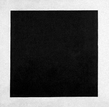
Another other implication of his argument is that it implies that an artist cannot envisage the final location for an artwork when it is being produced in the studio. Indeed, many artists are commissioned to produce work for specific places and take huge amounts of trouble over the piece and how it’ll work in its intended location like the installation piece for the Museum of Contemporary Art, by Robert Gober ‘untitled 1995-1997’.   In my opinion, it would be quite wrong to suggest that the work is somehow diminished because it was fabricated/painted/printed/sculpted in one place (the studio or workshop) and hung or installed in another.

 Image

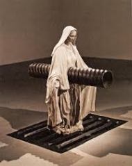
Robert Gober Untitled

The second suggestion Buren makes is that the studio is an essentially private place. This is partly true as it is a place of work and not a public viewing opportunity. However, many artists sell directly from their studio to the public, collectors or dealers and therefore, it is frequently a more public environment than perhaps Buren gives credit. (He does acknowledge this in the article but fails, in my opinion, to follow the logic of his own argument). He makes a subsidiary point in relation to the studio’s alleged privacy by suggesting that the studio is also an ‘ivory tower’. I find this point hard to understand in his overall thesis. Does he seriously believe a place of work for artists is something remote, exalted and removed from the real world? This seems seriously at odds with the fact that most artists live precarious existences on the edge of poverty inhabiting the cheaper parts of towns and cities often living cheek-by-jowl with the poor and are themselves often deeply sensitive and thoughtful individuals whose practice is intricately entwined with their histories and lives. To suggest that they inhabit remote and privileged places therefore is not born out by the evidence.

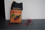
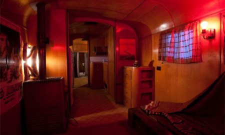
It may be true, and Buren hints at this, that some artworks end up in lofty places, but that is not to say that they were conceived in them! After all, if a dog is born in a stable does not make it a horse. Curiously, Buren goes on to say that a gallery is tantamount to being a cemetery for art works: “this is where they all arrive in the end, where they are lost”. He balances this, and to an extent his essay seeks to have it all ways, by stating that the graveyard of the gallery is as ‘nothing to the oblivion faced by those works that never make it out of the studio’. Again, I find this hard to reconcile with empirical evidence. This is not true for example of the work that Duchamp was working on secretly in his studio between 1946 and 1966 ‘Etant donnes’ or the black paintings of Goya’s house. The reputation of these works blossomed after their hidden studio genesis.

Image

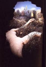
Marcel Duchamp Etant donnes

The third point Buren makes, is one about art being made in a stationary place and then moved to somewhere else. He talks of ‘the unspeakable compromise of the portable object’. But this to my mind suggests a truism which reflects little on the status or life cycle of an artwork over time.

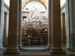
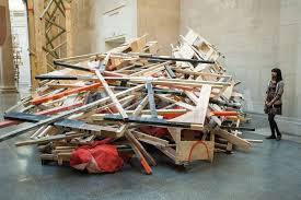
Buren does have interesting things to say about the homogeneity of the way in which artworks are currently shown – “according to the prevailing taste of a particular time.” But, according to his strictures, how then are we to recognise the different qualities of an artwork and does it matter how they are shown? This brings me to the works of artist Doris Salcedo. She often produces works for specific locations. For example, her collection of chairs is an entirely-site specific piece, located in the space between two buildings where an office had previously stood. This piece could not be made in a studio and could not be transported to a gallery after it was shown. What is more, the piece no longer exists, except as a photograph – a secondary image – a chimera of the original and not the original. It is therefore, not prey to the hostile gallery environment. Rather, it is miraculously free.

Image

Doris Salcedo Chairs

Buren finally nails his colours to the mast when he talks about the sense of reality and truth that works seen in the studio have. I have problems with notions of truth in a work, as do many other commentators. As Foucault wrote in the History of Sexuality, that by some process of confessional, the individual (or work), can offer up something true as opposed to something false.

Raymond Williams makes an interesting point about where art is made and displayed and the status conferred upon it. He argues that status is based on whether or not it is actually seen by anyone. In a comment on ancient cave paintings he says:   “they, (cave paintings), are now generally seen as art, indeed in many examples as mayor art. Yet, they are commonly sited in dark and inaccessible places…” Raymond Williams The works of Art Themselves, ‘Identifications’ Cullture, Fontana Press, London 1981 p119. Williams argues that we would not deny these works the status of major art works if they had been seen only by the person who made them, until of course we had, perchance, come across them. This raises questions about the studio verses gallery, shall we say the display conundrum. If a work is not seen, even outside of its place of manufacture, would we not want to recognise it as art at some later date? Indeed, Buren sidesteps answering the question about whether something is an artwork at its time of making or something else.

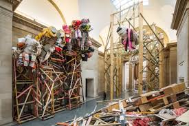
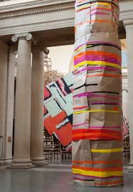
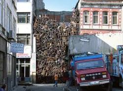
The case for installation art, throws Buren’s argument further into relief. Installation works are often site-specific and frequently made/assembled/created where they are to be shown. Indeed, Mike Nelson has, as Claire Bishop says, “neither a studio, nor collectors. His work is about its engagement with a specific site”. It has, she argues, “a critical stance towards both museum institutions and the commercialisation of ‘experience’ in general”. (Page 44 Claire Bishop, Installation Art).

Image

Mike Nelson Quiver of Arrows


In fact, Nelson’s approach to his art is to create scenarios that are scripted in advance. He uses, according to Bishop, a complicated web of references to film, literature, history and current affairs. The work then typifies a practice that is outside the studio gallery environment by its very nature. Salcedo’s work makes the same point, only more forcefully.   Mieke Bal argues that Salcedo’s work, like her 2004 installation work Neither, “needs to be built in the specific space where it is subsequently shown, (it is) no longer sculpture because it is immovable. This point again makes an interesting dialogue with Buren’s point about moveable art. Bal also makes the point about the permanence of the Salcedo piece: “Once it is there, it is not possible to move it around to see if another arrangement would work better”. It is a unique moment caught where it is and remains there unless of course it is removed after a time and then maybe little or no trace remains. Bal argues that the 2007 piece Shibboleth ‘brings the artist’s relationship with space full circle’. The work had to be filled in after the shows end. The entire work all but disappeared under concrete.  But as any visitor to the Turbine Hall at Tate Modern will testify if they look down, the work is not entirely lost. “Concrete always keeps a trace of what lies beneath. It loses relief but keeps colour, or rather discolouration. We can see colour as the remnant of life, persevering against all odds”. Bal 2012

Further to this, is the question of whether a readymade is an artwork according to Buren’s definition? After all, these are not made in an artist’s studio but are offered up by the artist for display. What then of the readymade transported to the studio and left there?   And what of Performance Art? It is, neither made in a studio, and may never be experienced in an art gallery either.

Finally, there is an implied discussion in Buren’s piece about what is art. But this is a subject for another occasion. I have attempted here to discuss the gallery/studio vector through looking at the essay by Daniel Buren. His piece raises some interesting areas for consideration, but is undermined by a number of factors, not least of which is his lack of consideration of installation art and of performance art, which is the elephant in the room as far as his argument goes. And it is maybe, that he was taking a swipe at the growth of performance art of the 1960s (Fluxus group etc). He doesn’t mention it by name but then things are notable by their absence, about what is not said as much as what is, as Freud and others would no doubt testify.


Standard