Thoughts on what it means to have a mixed practice as an artist

As I am an artist with a mixed practice, I’ve been reflecting on what it might mean to have a mixed practice. I been aware of both the advantages and disadvantages for sometime, but in a recent conversation with Paul Fieldsend-Danks, he suggested that my artist statement on my website did not adequately reflect someone who has a mixed practice. My first reaction was to try and rewrite my statement so as to provide more guidance to someone looking at it. But this, only partly addressed the problem. I became aware; that I needed to do more than just amend my statement. What I needed, was a more profound contemplation of what it meant to be an artist with a mixed practice first and foremost. I then need to consider how I might articulate that in my statement and in other ways. This led me to try to research thinking and critiques of artists with mixed practices, and on the whole notion of mixed practice in particular.

By looking at artists that I knew had mixed practices, like Martin Creed and Tracey Emin, I hoped to find a key to unlocking this particular vault. But the books and essays I’ve found so far, just talk about their work. They don’t reflect on what a mixed practice actually means in relation to the specific artist and what might be inferred more generally. I need to approach the question from a different direction. Even then by typing in searches “artists with mixed practices” or having “a heterogeneous practice” has not proved to be terribly helpful either.

I sat and reflected, was I a jack-of-all-trades and master of none; was I an artist who didn’t know his arse from his elbow? Was it the case that because I hadn’t hitched my sail to a particular artist mast, that I really didn’t belong? So was it a question of belonging that I was avoiding confronting–there’s certainly an element of that as I prefer the role of the outsider–but was it that there wasn’t really room in the lexicon of art practices for the practice of mixed artist, or rather an artist with a mixed practice?

Paul FD has thrown me a lifeline by suggesting that I am looking at things from the wrong end of the telescope (my interpretation – not his words). What he suggested was that it all about context underpinning a practice and if you understand and articulate that properly then it is unnecessary to worry about what a mixed practice is.

So that leave me to consider the context of my work and practice and I feel I’m circling it but unable to pin it down – and pinning down is an emerging theme and pinning down or the avoidance of it, may in fact be the context. But in the meantime, I feel a bit like Dorothy having had the house picked up by a twister and deposited somewhere else remarks: ‘Toto I don’t think we’re in Kansas anymore.’

Standard

Review of Phyllida Barlow’s Dock at Tate Britain, London

    Image

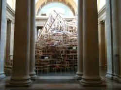
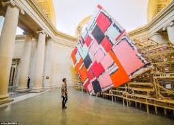
This is Barlow’s largest piece of work to date and dwarfs the Duveen Galleries at London’s Tate Britain.  As a huge fan of her work and contribution to contemporary British Art, I was full of expectation.

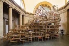
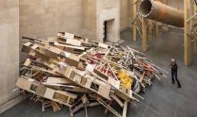
It’s a magnificent piece, there is no denying, stretching almost as far as the eye can see along the length of this central atrium within the gallery.  That is if one could see the whole sculpture as a complete whole.  But, you cannot do this as its many elements obscure a total view of the whole.  Instead, the viewer is forced to negotiate around the work, weaving a path, where one large object obscures your path and your ability to see.

Image

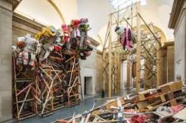
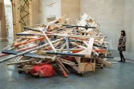
Dock contains all of the Barlow elements, lots of wood, lots of packaging material (black bags, parcel tape, string, rope) and reused material – at least, it appears to be reused, but given that this is her biggest work, its hard to see where all the material comes from, so I am assuming that much is new but made to look reused.  This leads one to consider how much the recycling of materials from one work to another is part of her USP, or whether it is just a practicality based on the contingency of cost and the type of materials and aesthetic she embraces.   I am not sure I really have the answer to that one here.  So let’s assume that some of the wood bearing the traces of dripped paint is reused from earlier pieces (if it isn’t, it manages to effect that conceit very convincingly).   Then this work begins to gel as part of the Barlow canon.

Image

But I am not convinced that upsizing her work has lead to the masterpiece I was expecting.  Yes it’s a brave work and yes Tate’s director, Penelope Curtis has to be applauded for commissioning this work, but it’s not a fully resolved piece in a number of respects.  The high structures, which resemble Russian wood scaffolding (at least Soviet era Scaffolding, I’ve not seen the post era stuff) give the elevation that Barlow has successfully utilised in the past, I’m thinking of the work in the downstairs lobby of her recent Hauser & Wirth Piccadilly show.  What’s missing in the Tate piece is something of the vulnerability of that work, the precariousness of the elevated objects on flimsy stems.  At the Tate the structures are rigid and box like and feel stable, even if some elements over hang them.

Image

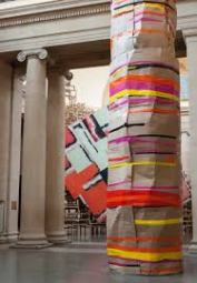
So what’s missing from this piece is some of the vulnerability of her earlier works and also some of the colour and curiosity too.  Elements look derivative like the large tube structure and the high platforms have echoes of Tracey Emin’s raised seaside chalet or big dipper in structure and material but lack the interest Emin’s does and the vulnerability she engenders.  Also, the desire to see above our head height which Emin’s work provokes.  This is lacking in Barlow’s work at Tate and was so masterfully there at Hauser & Wirth where you could see up close from the upstairs balcony what you could only glimpse and imagine from below.  Now I do chide myself for not looking at Tate Britain from the member’s lounge or its environs on the upper floor to see whether there were any elevated views of Barlow’s Dock, and it is possible there are.

Image

The Barlow Dock, has echoes of the riverside activity of times past on the adjacent Thames, but it seems like a flimsy hook to base the work and is also not necessary to anchor the piece.  It does not add to the work and it quite possibly detracts by over determining responses to the piece, stripping it of enigma and encouraging viewers to read things into elements that might not be helpful.  There was one element that I think really didn’t work and that was the collapsed piece that looked too self-conscious. We are all well acquainted now with the language of sculptural pieces that have constructed and deconstructed echoes side by side.  It’s no longer necessary and looks jokey in a more visually enlightened age.  We need to develop a new vocabulary, that language has been thoroughly explored and feels dated.

Image

There is much to admire and I will certainly visit again, but I think this large commission has been an important learning curve for Barlow as it should be for all artists who are encouraged or are contemplating up-scaling their work.  Sometimes it does not come off.  We need to treat the urge to up size with extreme caution.  It might be that Barlow’s work does not suit the grand gesture like this and is better small.  And on that note lets hear it for the smaller artwork, sometimes less is more and we shouldn’t feel embarrassed or uncomfortable with that.

Image


Standard

School of Saatchi – BBC series from 2009 a review

I thought it would be a good idea to watch the whole series as I’d only seen one programme originally when it was broadcast.  There was some good comments in it, for example, Tracey Emin said: ‘that the importance of life drawing was that it engaged the hand, the eye and the brain.’

Image

In looking at a short-listed video artist, questions were raised as to what made a video art, and not a TV programme? This is a good question for me to consider, because recently I have been making a couple of films that I regard as video art from found film or sound. The question is why are these art films and not feature films, entertainment or some other form of documentary film?

The presenter said the contemporary art has rules that were calculated and considered. Tracey Emin said it’s about what you take away or edit out : ‘like around my bed piece – there were many things that I edited out from what was originally there so that the one left what and presented at Tate was my distillation of many objects from around my bed.’

In program two, Charles Saatchi is quoted as saying “the way to improve as an artist, is to make work.”

Image

A question was also raised as to what is the reason for doing something? And what makes it accessible to an audience. Was it made accessible by reading the label or hearing about the story behind a work? A of these it was said, were important considerations.

It was also said that if you want to undermine something, say an idea or a piece of work, then you need to focus on it and “also do it in the boldest, most extreme way you can” says Martin Creed.

“Interacting with a public who have no understanding of conceptual art you need to make your work accessible.” Says Matthew Collings art critic and commentator. He goes on to say “things don’t have a mystery of their own when he was talking about the fishing net huts on Hastings Beach … Maybe, I should bear this in mind when thinking about how to present my chair piece.

Programme 3 considered replacing or taking a new look at an existing piece of art – it was suggested that work that is referential in this way and has a relationship with the past must also be able to speak of the now. Equally, it is important not to force a connection that isn’t there or is pretty tenuous. Check out Nina Saunders the age of reason 1993, she is an artist who works with and reforms chairs. A useful artist to look at as I have since done in order to help me think about my chair piece.

Question how do follow-up an idea or response to artwork Matthew Collings thinks that you must be sincere, thoughtful and energetic. In the preparation for the final exhibition where the work of the 6 artists would be judged a number of issues had resonance for me and raised concerns and many parallels with my preparation for any exhibition, and of course the degree show.

Be careful about ideas that are good but for which the execution is weak and also be careful not to leave things until the last minute. Don’t be familiar or polite or politically correct in your work. A work must have honesty and a sense of daring – don’t forget health and safety considerations – like the guy who had presented the Vandergrift generator but haven’t thought through the health implications. Equally, it was said that an artist should be careful not to lose the subject of their work in the love of the materials.

The piece needs attention, beware your work isn’t too literal it’s not good enough to argue or it to be apparent that ‘what you see is what you get’ when you look at the artwork. Equally, it was suggested that a well-polished piece is bad if it has no spirit in it.

Standard