What’s The Point Of It? Review of Martin Creed Exhibition, The Hayward Gallery, London


Image

I want to argue with my own instincts in this review because I like the work of Martin Creed. I think there would be little of interest to say except that I liked the show and then to single out particular exhibits that I found most interesting and explain why. I think it might be far more interesting to take a contrary position and to attempt to argue against Creed’s work and my own attraction to it, in order to examine the nature of my interest. I also think one has the fiercest arguments with those one is closest to. Because I see many similarities between my work and that of Creed’s, I feel as if I am arguing with myself, if that doesn’t sound too pretentious.

The exhibition is the first time that London has had a major review of Creed’s work, and builds on the splendid run of exhibitions that the Hayward has had over recent years. It is also the first large-scale collection of his work to be shown since he won the Turner Prize in 2001.

Ranging from the whimsical to the downright offensive and shocking, the exhibition comprises extensive tones and much light and shade. It has been well constructed in this regard, with moments of high drama punctuated by reflective calm. But I wonder whether Creed and the curatorial team have worked too hard and too self-consciously to manipulate the audience.

Image

The exhibition begins with a revolving neon sign on a huge scale – resembling some demented Angel of the North with dangerous and threatening arms like helicopter blades barely above head height and liable to take your head off. The neon says ‘Mothers’ and one is hit (sic) by the Kleinian good breast bad breast dichotomy of the mother, both omnipotent and potentially castrating or beheading. Is this symbolism gone mad or part of some wider meditation on Mothers’ role in society? We are left to ponder, but only slightly because the power of the piece and its scale tells us all we need to know about how he regards mothers. And if we were in any doubt, the room is made further unnerving by the presence of his piece Work Number 189. It’s a large collection of metronomes lining the wall and all beating a different incessant rhythm. The effect is to increase the heart rate and make you feel sick and uneasy. It is hard to remain static amid this heightened state of anxiety, juxtaposed to the swinging outstretched arms of the enraged Mothers. Certainly one is assaulted as soon as one enters, and not for the only time either in this exhibition.

Image

On a positive note, it is impressive to see that the Hayward are happy to destroy the fabric of their building to accommodate an artwork, in this case the Mothers piece. The gallery has sawn off a number of the original concrete balustrades to accommodate the swinging arms of Mothers on the ascending ramp to the next room. This also adds to the danger of the piece suggesting that the arms have taken out part of the building in the same way they threatened to take off your head. Again, is this is more manipulation of the senses.

The next irritating thing about the exhibition is the free guide you are given when you enter. Instead of providing the visitor with a room-by-room breakdown of the works or even the major highlights, we are treated instead to an A to Z of Martin Creed. I was left wondering whether some retrofitting of titles was necessary to include all letters. On one level, the taxonomy is an interesting idea in a guide. It suggests global and intellectual transcendence. More interesting and more modest would have been the absence of one the major letters from this alphabet. But no, they are all ticked present and correct from Dogs to X’s and Z is Ziggurat. It’s a little too neat and too predictable and I thought Creed was smarter than that.

Creed’s grander gestures tend to fall flat in this show. Take the car on one of the balconies which starts up automatically, followed by all the doors, the boot and bonnet opening and the radio blazing out, then just as suddenly, they all slam shut and are quiet. It’s a bit too obvious and leaves you feeling empty as you gaze at the kit of hydraulics which effects the openings and closings – more interesting might be the kit without the car. Just the hydraulics opening and closing nothing would have been very powerful.

Image

The next grand gesture is a large brick wall on another balcony that is made from a multitude of different brick types and forming a striated elevation as pointless and it is striped and seemed to echo the sky scape around rather obviously. It did not add any insightful comment bar the apparent.

Image

The greatest grand gesture I missed because of bad sign posting. This comprised a vast projection of a penis gradually rising from recumbent state to its rigid priapic greatness. This was on another outside balcony and again mimics the phallic erections beginning to fill the London skyline. It was rather too obviously poking fun at the Gherkin and Mobile Phone (all penis extensions of their architects or commissioners) and all presumably liable to fall flat at some point as their energy and power wanes. Like all erections, including this one, they will end up looking limp and pathetic. One artist (Tracy Brock) who saw it on another visit described it as ‘majestic’ and was clearly impressed by it. The piece itself had a health warning that it comprised adult content. Was this nanny state over zealousness after all, aren’t we inured to things like this? What boy hasn’t experienced an erection? And boys get them after all from their earliest infancy, often while being suckled by their mothers (Klein again?). And what girls in mixed households will not have observed the difference and acrobatics of their male siblings appendages?

The piece provided interesting counterpoints to be sure with architecture, but in the two thousand and teens, haven’t we gone beyond the need for artworks that deliver an obvious jokey punch line? Ok so his naming of artworks is not in the same offensive league as those more pointless jokey titles that many YBAs excelled in.   But even when the title is absent, the joke isn’t and therefore the artist (Creed) needs to ask himself is he going too far?

Image

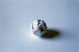
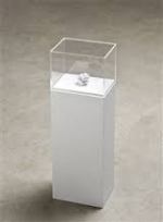
The artist Steven Geddes accompanied me on this visit and he pointed out that it is worth keeping every piece of work, every crumpled or folded piece of paper, as they can be an artwork if presented in the right way. He was alluding to the fact that a screwed up ball of paper was presented in a vitrine and folded pieces of A4 were opened out and framed on the wall.

ImageImageImage

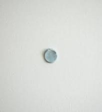
Steven Geddes was not being ironic either, but pointing out how important it is for an artist to keep things, especially one like Creed where everything and nothing can become an artwork. Is Creed being ironic in what he offers up as art? I think not. To end on a positive note, his work shows that a good artist can make us look at things in a new way, whether they are folded bits of paper; a piece of blu-tack on the wall or a film of a pretty girl taking a dump on the floor of a white cube gallery space.

Image


Standard

Inviting the public into an artist’s studio.

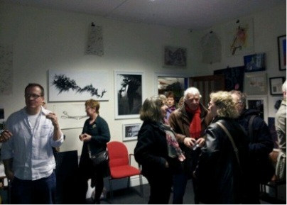
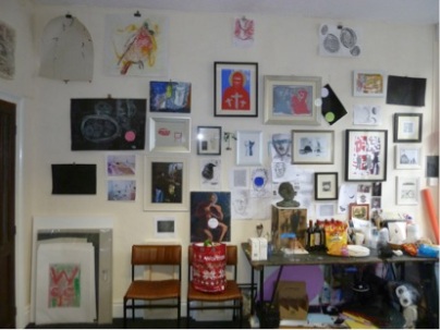
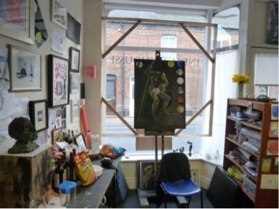
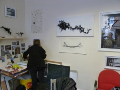
With two colleagues (Tracy Brock and Bev Broadhead), we decided to invite friends and fellow artists to our studio space. Having recently moved in, we wanted to welcome them and also to show some recent work. I decided to use my wall space more as a salon type hang, to get work some past and some present and some on-going out on view. This was done as much for my benefit as it was for the visitors because I tend to make a lot of work and then shove it into a draw or a cupboard and don’t look at it again or see it as part of the body of work. It was interesting to me partly because I have a mixed practice to see drawings beside prints, sculpture, painting, and photographs. Looking at the work I wonder whether things are too disparate or whether they do constitute a recognisable body of work by a single artist as an outside observer might recognise. Yes, I know that they were all produced by me, that they all represent ideas and concepts that I’m interested in, or have researched and thought about, but productivity and heterogeneous output both alarms and pleases me.

Image

I am also interested in producing work in one medium and then seeing how the same idea can be realised in another medium or taking a work and moving it from 3-D, to 2-D, and back into an element of a 3-D piece. Clearly, the work changes, develops, and sometimes is spoiled or even retarded by the slippages back and forth. But, as my practice is in part one of experimentation, the work doesn’t stop, and therefore no work or idea is completed, or exhausted. It might be left behind for a while but on this journey I will sometimes double back, and catch up with it again, reimagining it or having a new conversation with it.

Image

And come back to my earlier thoughts on the opening, it seemed to me that the reason for doing it was not really to show work, but to begin a conversation, the conversation I might have with my own artwork, a conversation I might have with friends and other artists, and a conversation my work may have with my two studio colleagues’ work. So, the dialogue or dialogues were happening on many different levels and with different potential outcomes–all relevant, all interesting, and all about the beginning of something rather than an ending or a conclusion.

Image

I am sure too that I need to think more about the difference between a studio where I make work and a gallery or other venue, where work may be displayed. Of course, I am aware of the work of Daniel Buren and am sure that this is just the start of my thinking about how I am using a studio space and with what purpose – other than simply to make art.

Image


Standard

Finding a studio space

As I’m only a part-time MA student, I’m not entitled to a college studio space. Over the summer I’ve been looking for places to work preferrably close to home and hopefully with other artists.

The process of looking has made me reflect upon the uses of a studio and more importantly, how I will work in my first studio. Up to now, I’ve had my college studio spaces, but my practice to date has mostly meant that I made work in workshops, and only used my studio space for storage and display. Now, I want my studio to be my workspace I do need to think and reflect upon how that might impact upon my practice and my ways of working.

I know Daniel Buren’s thoughts on the studio and practice.   I have also visited other artists’ studios and seen how they use them and have been able to draw some inspiration as to how I may make mine work for me. But, I am under no illusion that my work is likely to change to respond to my new circumstances.

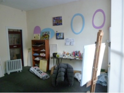
I have found an old shop in Cromer with 2 decent sized rooms and have found painter who is giving up her Outpost studio to take one of them, and I’m hoping Tracey Brock will share the other room with me. The other advantage of the old shop is that it would make a place to exhibit work both in the window, and also from time to time using the space for pop-up exhibitions, maybe inviting other artists to exhibit there too.

Image

New studio space


Standard

Working collaboratively.

I’ve been thinking more and more about working collaboratively with other artists. I’ve had some experience with the salon I established the group of fellow students during my undergraduate years in Norwich. We produced several pieces based upon instructions and exchange of objects, artifacts and artworks. Perhaps the most successful collaboration was with Jellis Artist, and the film that resulted in the instructions I sent her in New Zealand. The resulting work, ‘I love you like salt’, we uploaded onto Vimeo and has now had over 2500 views.

Recently, I have also collaborated with the artist David Kefford, a director at Aid and Abet, the artist run space in Cambridge. Together, he and I made an intervention piece in the chapel at Jesus College Cambridge. We have also collaborated on number of sculptural pieces and a short film and thinking about further collaborative works.

I have seen work produced collaboratively by artists such as Gilbert and George, Jake and Dinos Chapman, and Townley and Bradbury. All these artists collaborations seem to work in different ways, but they seem to share something in common being either siblings, married partners, or lifelong soul-mates (collaboratively speaking).

What then marks a successful collaborative arrangement?  Certainly a sublimation of ego is necessary.  When I showed interventions recently made by the artist Tracy Brock with several of my artworks I deemed ‘collaborations’ and exhibited them on my studio walls.  A fellow artist was appalled that I was happy with my work being interfered with.  I regarded it as a compliment that a fellow artist wanted to interact with my work and felt no loss of authorship.

Image

Standard

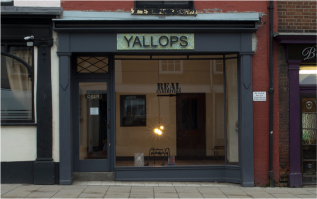
Review of Real Exhibition at Nunn’s Yard and Yallops, Norwich

 Image

The double exhibition staged at two galleries 20 meters apart is an exploration of what is a real artwork and by implication, whether either or both is a real exhibition. They aim to question what is authentic and what is false or constructed. What is simulation and simulacrum?

Image

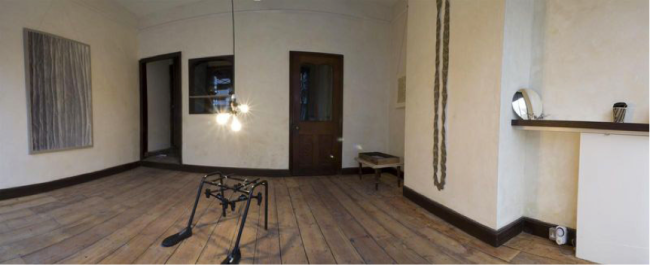
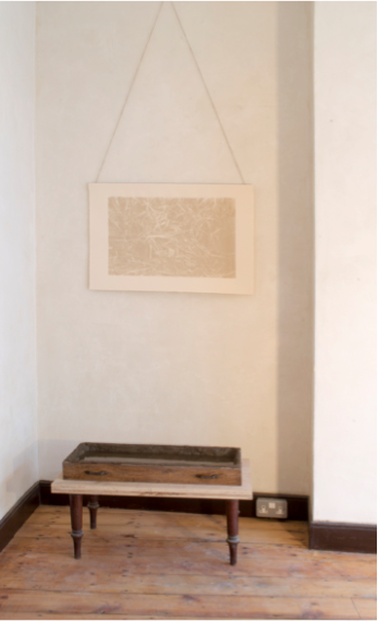
This is a subtle but ambitious project that operates on a multitude of levels. In Yallops, a number of objects and images adorn the wall, floor and a variety of ledges. Some are found objects and some assemblage, some prints or maybe paintings. The exhibition is muted and largely monotone echoing the muted period surroundings of the gallery. Are the objects left from some other activity or are they on their way to being installed somewhere else? There is no guidance to lead the viewer. But all have been carefully placed and further looking sees a distinct dialogue between and within works. A rippled painting by Thorraya Button oscillates between being a print and a drawing or a piece of fabric – it echoes the tone and muted colour of the print or photograph (which is it?) of Rebecca Kemp’s work on paper opposite. This in turn is dimly reflected in a wooden drawer lined with mud and full of water placed on a low table or pair of table legs – it is not clear which – also by Kemp. Its stillness has a menacing quality, the drawer handles like eyes looking blindly into the room, its liquid contents, lost and hopelessly out of place, caught in a space that is neither transition nor destination.


Image

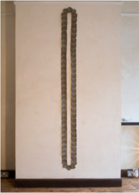
Tracy Brock’s curious ovalate piece is made of 69 prints or photographs of dirty grey with a red blotch in the center. It resembles a large opening or slit but has the minimal sense of movement as in a series of separated film stills with the base and top ones forming arrow shapes and suggesting movement around the piece. Closer inspection reveals that the ‘frames’ contain an image of a woman in red either falling between large buildings, or on the other axis, maybe soaring up between them? We are left to ponder her assent or fall, infinite and never ending.

Gillie Bexfield’s brown glass goblet from the 1970s sits on a makeshift shelf of unpainted plywood. The goblet reflects the outside world on the near side and inverts it like a camera obscura on the reverse, again raising the question of real and its inverse and echoes the two viewing positions apparent in Brock’s piece which it is so clearly in dialogue with.

Image

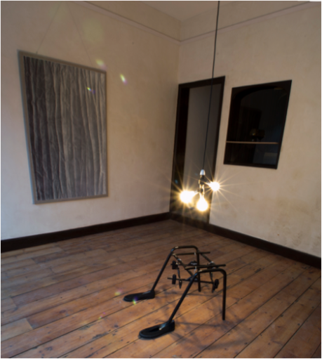
Gregory Hayman’s piece is a weirdly surreal assemblage of a metal chair base, coat hangers, plimsolls and 3 tungsten light bulbs hanging at waist height from the ceiling above it. It hints at the figurative and is the only real evocation of the person in the exhibition; combining as it does the apparent apparel and comfort of people, whilst at the same time providing neither.   It casts a long shadow from either the natural light or the lopsided light bulb arrangement. It is both comical and haunting at the same time suggesting a Zimmer frame that has found its own feet but not going anywhere and a shop-hanging rail that has sunk into the floor. The Hobbs (sic Hobbes) labels on the clothes hangers hint at another level of meaning without revealing its intention. The light is descending into or ascending from a vortex of hangers dramatizing the relationship between the ceiling and the floor.  Of all the pieces it seems most alone and not in dialogue with any other attracting a sense of desolation.

Image

Jellis presents an homage to the Meret Oppenheim surrealist cup and saucer covered with fur. Jellis’ take hints at a culture of oral consumption and its disposable need using a paper takeaway cup with plastic top and wooden stirrer, and rather than being fur coated the pieces are carefully covered in human hair in a pattern of triangles and spots.   Her piece has an intimate dialogue with her other work: clear fingers sprouting a woven web of human hair beckoning and taunting the hairy cup – the finger straining to pleasure the g spot but at the same moment caught within its own desire for fulfillment.

Greg Lyndsay-Smith’s works on Perspex could easily be overlooked they are so unassuming. Like gunshots on glass or sperm on a microscope slide, the two white ones could even be breath on the window. The central coloured one resembles an enlargement of blood and tears. All look longingly in on the rest of the exhibit pieces like lost emotions caught in the liminal between the outside world and the inner gallery space, between the real and the artifice.

The second exhibition at Nunn’s Yard only partly succeeds in stretching this dialogue between the real and its representation.   It comprises photographs in situ of the works in Yallops. Are these the real art works? The exhibitions take their cue from a similar idea staged at John Latham’s Flat Time House in London where identical exhibitions took place in neighboring buildings. Direction signs painted on the windows of both galleries with arrows pointing to the other gallery advertise the Real exhibition, a nice touch to underline the central theme.

However, the Nunn’s Yard exhibition would have been greatly enhanced had the photos been placed in the same spaces occupied by the physical objects and images in the Yallops gallery. This would have heightened the sense of similarity and displacement and driven a more profound questioning of what was real and what was its representation. In all, both work to interrogate the nature of perceived hierarchies between artworks and show an appreciation of the conversations that exists between the world and representations of it.


Standard